Typography
Knight
Typography
Aix-En-Provence
Client
School Project
Year
2025
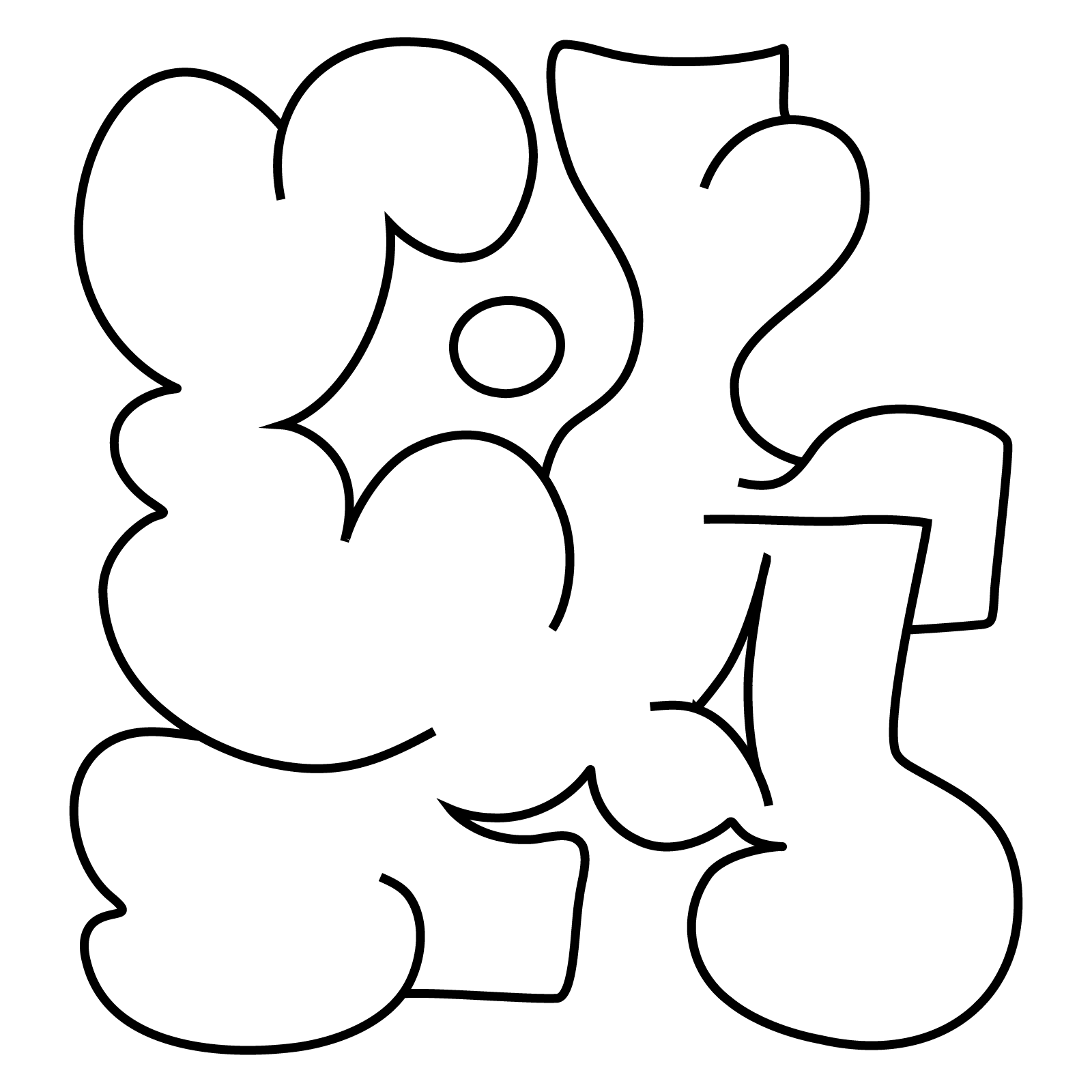
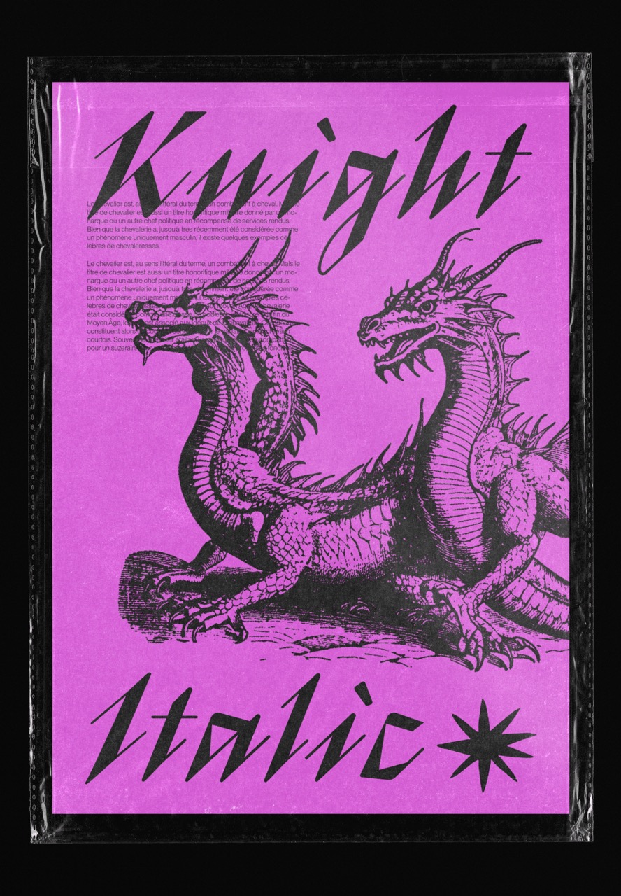
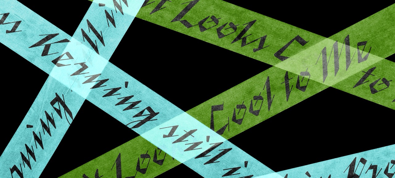
Knight is a display typeface born from a desire to step outside my comfort zone. I focused on a very expressive, aggressive and confident italic. The project blends multiple influences: medieval calligraphy, gothic and fantasy references, as well as punk and fanzine culture. Knight is designed for impact, emotion and strong visual statements.
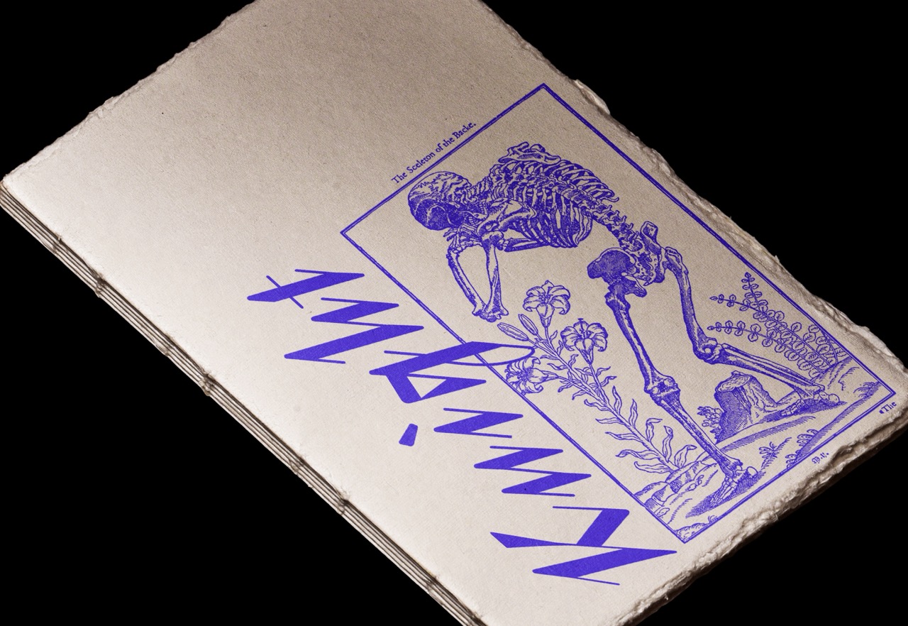
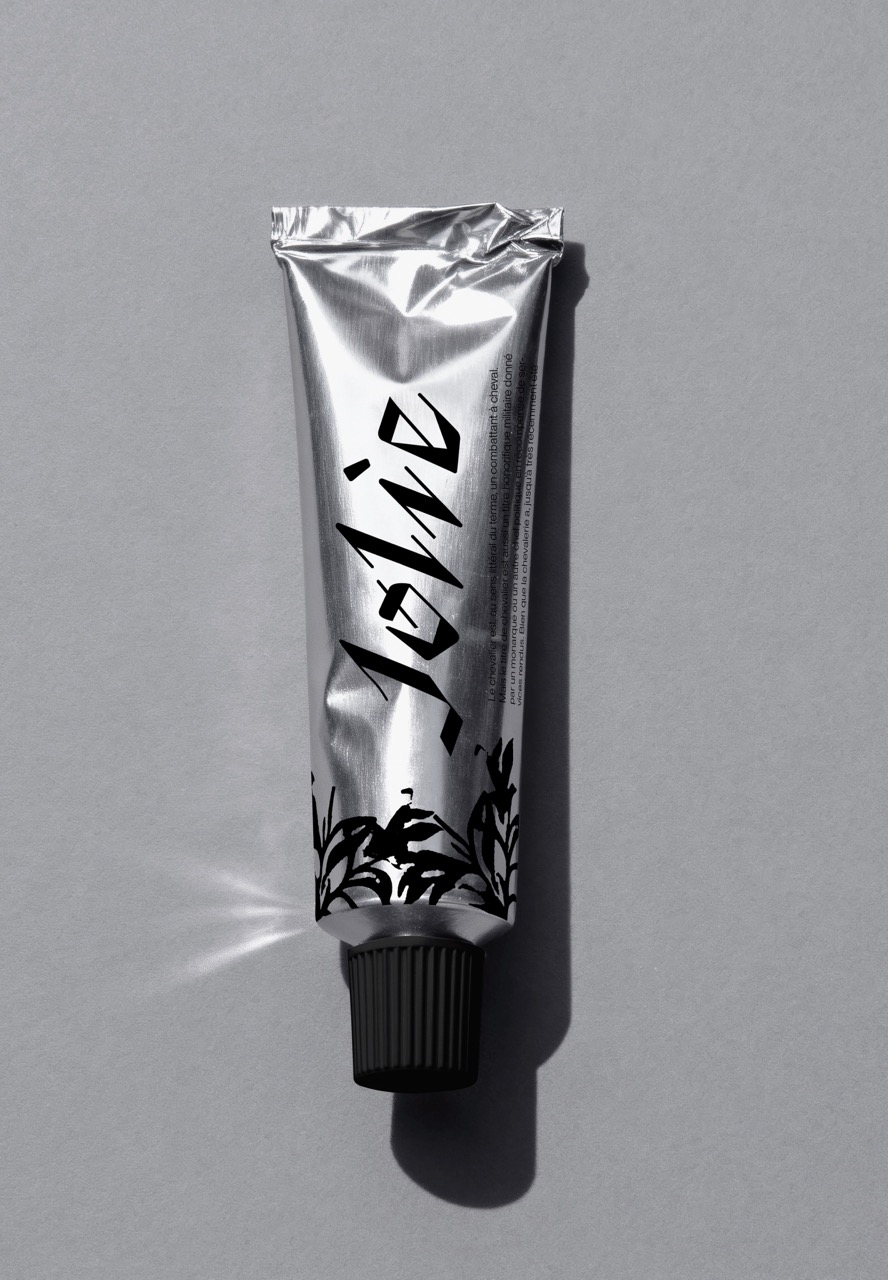
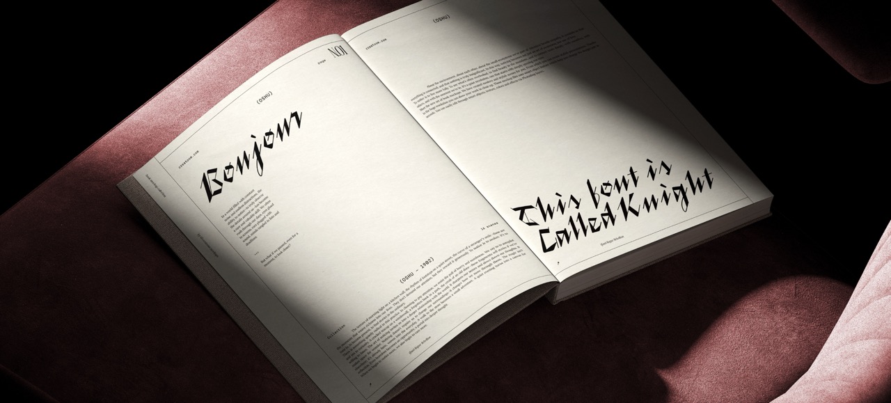
The strong slant creates a forward motion, evoking attack, momentum and tension. Strokes are exaggerated, sometimes broken, with sharp and angular endings. Each character is treated as an expressive shape on its own, prioritizing energy and gesture over neutrality.
What I've Learned:
A good idea has to work 26 times.